- Home
- About Me
- My Work
- What I Do
Design & Development
Digital Marketing
Consulting & Speaking
- Weekly Blog

Design & Development
Digital Marketing
Consulting & Speaking
March 28, 2017
In some ways, a website redesign is almost more work than coming up with your initial website. Sure, with a redesign you’re armed with data from your previous site such as: what worked and what didn’t, which pages people visited most and a tested navigation menu but you’re also stuck with the pressure of making all of that better AND ensuring your website is responsive too! Oh! And don’t forget that you also have to take the time to 301 redirect all your old pages to your new ones and pray that Google keeps your ranking consistent!
While a website redesign may seem like a daunting task, if you haven’t redesigned your website within the past 4-5 years, it’s likely time you take a look at doing so now. Responsive web design is as important as ever, screen resolutions have become larger and users have a higher expectation of their experience on the web. They want their information fast, simple and available at their fingertips.
A few common trends quickly became evident as I reviewed the Windsor-Essex website redesigns that “wowed” this year. Most incorporated some kind of call-2-action, most made use of high resolution photography and of course all of them were responsive. Let’s take a closer look to see signs of additional common trends in the list.
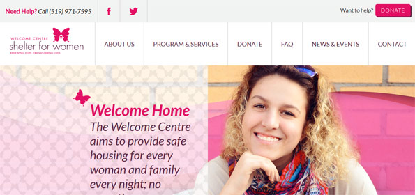
The redesign of the website for the Welcome Centre is exactly how a non-profit organization should design their website. Not only is it a stellar design utilizing the entire 100% width of any screen size, but the the organization of information is easy to follow and provides just the right amount of content where needed. There are also clear call-2-action areas available for both donors and women in need. My favourite part? In the bottom right-hand corner they’ve included an “Erase Your Tracks” area which details how to remove the fact that you visited the website from the history in your browser.
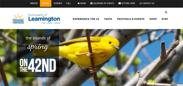
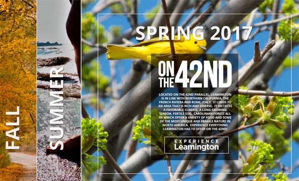
Thought municipality websites were boring? Think again! The Municipality of Leamington website redesign breathed a breath of new life into the “Tomato Capital of Canada”. The landing page for the website provides users an opportunity to choose the season in which they’d like to live, work and play in the municipality. From there, users are sent to a well designed page that includes gorgeous photography and specific information for various interests. By breaking the navigation into “experience”, “taste” and “events” for each season users can easily find the information they need and call, email or visit the specific contact for that experience.
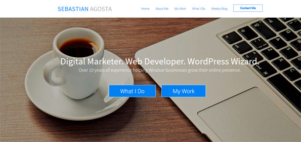
Toot, toot! You hear that sound? That’s the sound of me tooting my own horn. I know, I’m somewhat biased in my opinion that my website redesign “wowed” in 2017 but it’s such a vast improvement on my previous design that I had to include it in the list. I made sure the 2017 version of the Sebastian Agosta website was 100% responsive, included call-2-action areas such as my newsletter sign up and “Contact Me” buttons and incorporated all of my social media networks. I added client testimonials to the homepage rather than featured work to add a personal touch and I created a page for each of my services so users have detailed information on how I can help their business.
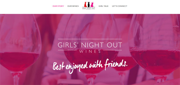
As far as branding, style and speaking directly to your target audience is concerned, Girls Night Out Wine by Colio hits a homerun! The branding is on-point from the get-go and throughout the site with slogans like “Best Enjoyed with Friends” and a newsletter titled “Girl Talk”. The redesign seemed to be heavily focused on community and engagement. The ability to review the wines, subscribe to a newsletter and Follow on social media are all very prevalent. Where the wine can be purchased and direct web links to those locations are available and easily found right on the homepage of the site.
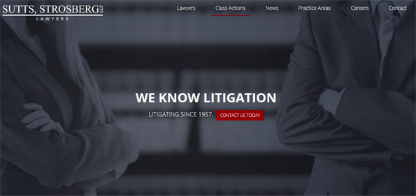
Professional. Informative. Sylish. That’s how I would describe the website redesign for Sutts, Strosberg LLP. Similar to the Women Centre website, the Sutts, Strosberg LLP website makes use of the entire width of the screen regardless of the screen resolution. There are various call-2-action buttons located throughout the website including in the center of the screen, above the fold when you first land on the homepage. Brief details on all practice areas are available within the practice area page however if you want more details, a simple “read more” link gets you there quickly. The fonts, photos and colours chosen for the design match the professional brand perfectly.
Topic: Web Design
Written By: Sebastian Agosta

My name is Sebastian Agosta and I'm a Web Designer/Digital Marketer/Google Ads Partner living and working in Windsor, Ontario. I've been designing and developing websites professionally for over 17 years and also have experience in SEO, social media marketing & content marketing. My goal is to help small to medium sized businesses in Windsor-Essex County grow their online presence through unique and inventive digital marketing strategies. My blog offers insights and opinions on all things digital marketing and web design.
![]()
